In 2010, Project Life was just beginning to spread, and there weren’t a great many product options for us digital scrapbookers beyond the pocket cards everyone was designing. The Queen of Clean & Simple, Cathy Zielske, put together a series of templates based on a basic grid design and released them as “The Monthly”. The idea was to use as many (or as few) pages as you need to capture your month, without being locked in to a layout a week. She even included a big, beautiful journaling page, so there was plenty of space to write. That’s been one of my primary struggles with Project Life … those journaling cards simply aren’t big enough for me to record my thoughts. And a scrapbook without good journaling is really nothing more than a photo album.
I quickly bought Cathy’s “The Monthly” template sets in both 8.5×11 and 12×12, because I like to have options, and decided to start a memory-keeping tradition for my new family that would involve printing an annual yearbook. Because of my obsession with my new last name, I dubbed them Key Moments. (See what I did there?)
I was feeling inspired by the 8.5×11 footprint, so I began crafting cover and title page layouts for my first two editions. I chose to run our albums from our first day of married life, the day after our wedding – July 1, 2008 – for a 12 month period that would end on June 30, 2009. Each book would run July to June, and span two calendar years. Kind of like a school yearbook.
Volume 1 was July 2008 – June 2009, and I got about half of the album done. I went back to my blog and pulled entries to add in-the-moment journaling. I was happy with where it was headed.
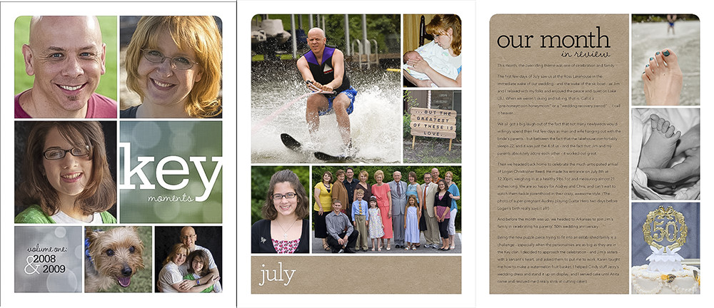
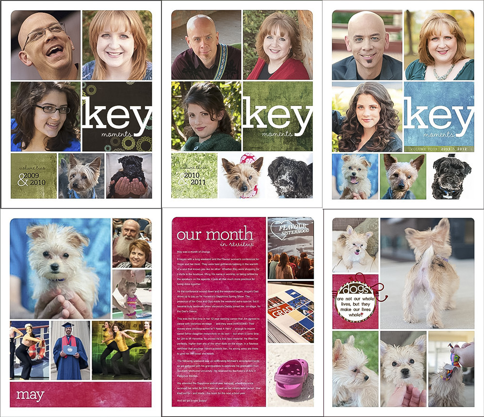
And then time got away from me. Each time I’d pick the project back up, I would decide to start with the current year and then go back to previous ones. So I created the title page for Volume 2 (July 2009-June 2010). And the title page for Volume 3 (July 2010-June 2011). And the title page and 21 content pages for May and June in Volume 4 (July 2010 – June 2011).
And then I did something very, very stupid.
You see, this is around the time that my health got completely out of control. I did a couple rounds of short-term disability, many medication changes, lots of different types of therapy, and finally long-term disability. My brain was in a perpetual fog. And I got a new computer for Christmas 2012.
As I moved the files from my desktop to my laptop, I did a bunch of re-arranging … and purging.
And I deleted the folder with all of my Key Moments files.
All of it. Gone.
And by the time I realized it, the drive with the backup had been completely re-imaged as a backup for my current system.
I think this is pretty much every scrapbooker’s nightmare. And I did it to myself.
Recently, I booted up my old desktop for a last-ditch attempt to locate the missing folder. It turns out it’s well and truly gone, but I did find the next best thing. It turns out I had imported all those completed pages into Lightroom, and though the original high-resolution PSD and JPG files were gone, Lightroom had lower resolution thumbnails in its database.
So I grabbed screen shots of those 63 pages, and brought them over to my laptop.
Now, I begin the task of recreating them.
I’ve learned a couple different lessons from this mess.
First, always keep backups in multiple places. I’ve got my Life Art directory on an external Passport drive that goes everywhere with me. It’s mirrored to a 3TB external drive that lives in my studio. And that drive gets a nightly backup to another external hard drive.
Second, my SyncBack backup no longer deletes files that aren’t on the source. Because that’s just stupid, and I don’t know what I was thinking when I made that little change.
Third, always upload finished, high-resolution pages to someplace on the cloud. I need to make sure I’m doing this one page at a time, rather than waiting for an entire album to be finished. I’ve started using ThisLife by Shutterfly for an external image repository (free unlimited space? Yes, please!) and my scrapbook pages are part of the automatic upload. I’m also doing this through Google images. Redundancy is a good thing.
And fourth, print batches of pages as you go, a couple times a year. If I’m not going to print the pages individually, but instead as a bound book – which is my plan with the Key Moments project – I need to upload the high-res JPGs to whichever printer I choose (Blurb or Shutterfly or whoever) and save it on their system. They’ll all let you upload images and save them, as long as you log in every six to twelve months.
Starting over gives me the option of changing things up. I decided to move to the 12×12 format so I’d have more room on each page for photographs. That meant I could redesign the cover and title page layout. And I began by creating covers for all seven volumes of our family’s Key Moments. (Volume 8 began on July 1 of this year, and I’ll create its title layout once we have this year’s Christmas shoot and family photos done.)
What I especially liked about my previous title pages is the consistency of putting Jim’s photo in a certain block each year, and mine, and Veronica’s, so as you page through the covers, you can easily see the march of time. What I didn’t like was the fact Jim’s boys were missing. Our relationship with them has changed over these past seven years – both softened and sweetened – and I want to honor that by including them in these books as often as I can.
So here’s what I did: The upper left photo is a 2:1 landscape block, perfect for group shots. Each year, I’ve included our family photo. In the beginning, it’s just 3 of us … in later years, it’s 5.
I’ve kept the three photo blocks in the second row as Jim, me, and Veronica; it’s most appropriate, since the boys were grown and living on their own.
The third row features our furry family members, with any leftover spaces allowing for an additional shot of (usually) Jim and me.
Because I’m sorta OCD that way, I created Smart Collections in Lightroom that would display all the kits I own that were created within the timespan of each album. Digital design has evolved so much over these past seven years, and I want the 2008-09 album to have a 2008-09 look, not a 2015 look.
Completing all seven covers makes me feel like I really can do this; that re-creating the sixty-some pages I lost is manageable, and with some organization and focus, I can get the best photos from each year into layouts, and those layouts printed into books.
Here’s to a better backup system!









 Aloha! Vintage Hawaii Postcard
 »
»
Leave a Reply